
This is part 1 in our multi-part series on user interface and web design.
Typography is dual purpose; on one hand, it's about aesthetics — how beautiful, balanced and pleasing the font is to the eyes. On the other hand, it's about the readability and meaning of the actual words that are written and how that is interpreted by the user. Good typography makes us read AND feel. It can set the personality of your product and enhance the user's overall experience of it. Really good typography is like a good magic trick in the hands of a magician. The magician knows all the nitty-gritty details involved in the trick but the viewer just experiences delight and fascination. Let's get into those details.
Typography, font, typeface, printed word - these terms are often used interchangeably; but how are they different? and how do they relate specifically to designing user interfaces and websites in the digital space? Let's start by clarifying some basic terms and then show you apply them to your UI design and web work right now.
Basic Terminology
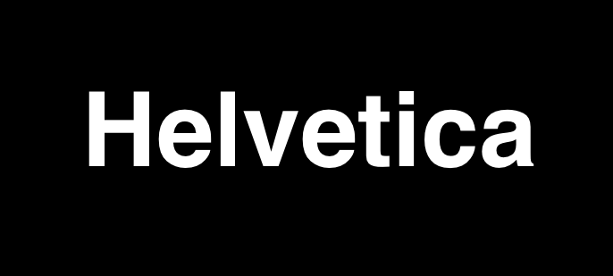
Typeface - Is the design of the letters in the alphabet pertaining to the style and shape of those letters. Typeface is a term that comes from the analog days of printing when letters were pressed onto a page via ink and metal letters. The typeface referred to the main grouping or name of the metal letters that were created. Example: Helvetica.
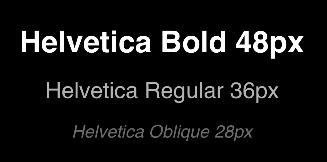
Font - In the digital world, font refers to the file that contains and describes the typeface. Think of the font as a file that tells the computer and printer how to display and print the typeface. It is in other words, the digital representation of the Typeface. Example: Helvetica Bold 48px is a different font than Helvetica regular 36px because it is a different file used to render the style/size/weight of the typeface.
Why they are often used interchangeably?
Common usage has effectively changed the conventional nomenclature and you'll often hear typeface referred to as font since most of the usage of typefaces these days are through digital formats that require a font file. If you're a typography enthusiast or print designer you might still be partial to maintaining a distinction between the two and will most likely refer to the 'typeface' you're using. But when moving into the digital realm, you'll be installing that typeface via font or font family onto your computer so it's generally accepted that these terms are synonymous in digital applications, but it's good to know the origin and proper usage.
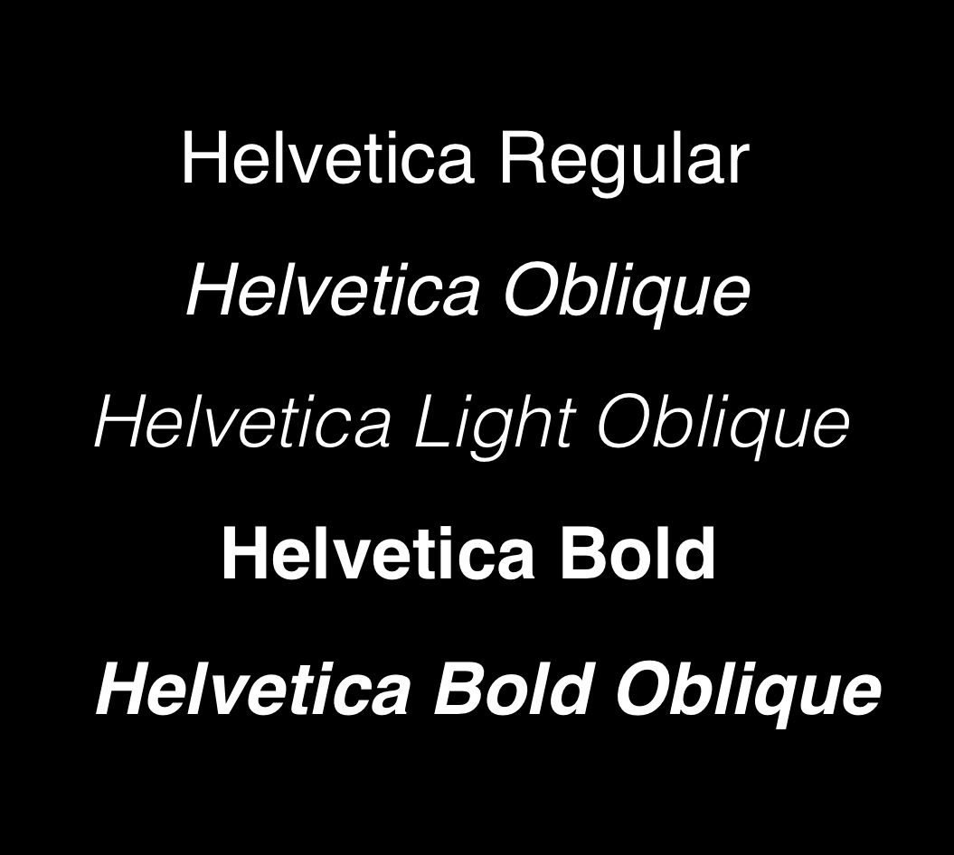
Font Family - Some fonts come from a larger font family. The Helvetica typeface for instance, has Helvetica Bold, Helvetica Light Oblique, and Helvetica Regular. The entire collection of these font files is called the font family.
These terms are part of what is known as Typography - or the art and technique or arranging type.
If you really love the study of typography and want to dig deeper, I highly recommend the following resources:
Typographic terminology https://www.youtube.com/watch?v=WzVl_ATHUQ0
Play with letter shapes https://shape.method.ac/
Web and UI Guidelines:
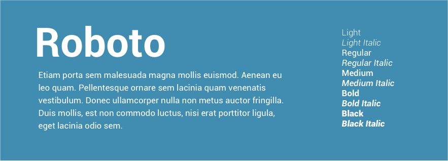
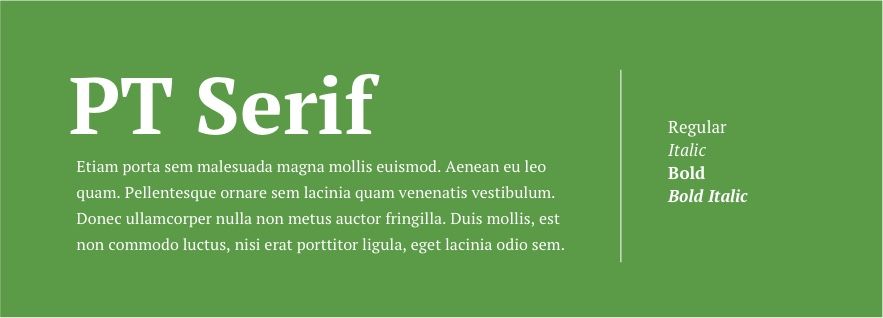
Styles of Typeface:
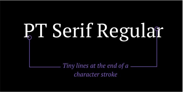
Serif - A small line added as embellishment to the basic form of a character
Psychological associations: authority, tradition, respect, and grandeur

Sans Serif - (without serif) meaning no decorative line has been added
Psychological associations: clean, modern, objective, stable, and universal
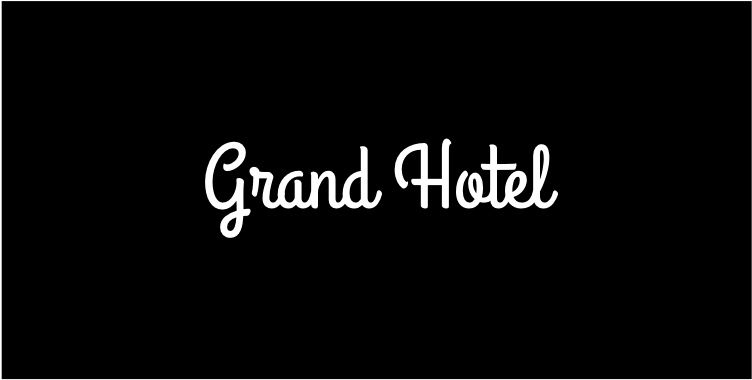
Script - Each letter connected together, looks like cursive or handwriting
Psychological associations: feminine, elegant, friendly, intriguing, creative
Text vs Display category
Typefaces for web generally fall under two categories. Those that are designed for body text and those that are designed for header text.
'Text' refers to typography that is legible and comfortably readable at smaller sizes. Text is good for long blocks of content such as blog posts.
'Display' refers to typography that is intended to be used at larger sizes at the top of the hierarchy rather than in large bodies of text.
You don't have to go crazy with typeface pairing. Pick one great font family that represents your brand well and can do a bunch of different jobs. Use one typeface that has a few different weights and styles and apply the principles of visual hierarchy and color to differentiate them.
Here is a fun tool to show you some really good-looking font pairings that you can try - https://typechem.herokuapp.com/sansita-700-ff8d95-quicksand-500-fdfdfd-070634

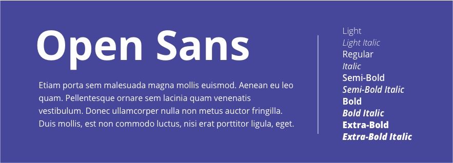
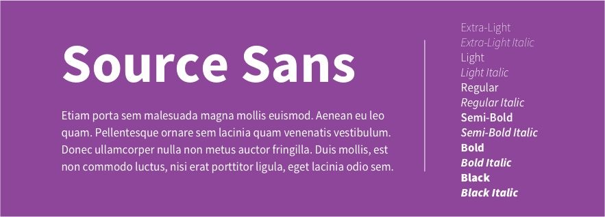
Some of my favorite Google fonts
Choosing your font size
Body size
Pick the size of your body text first. This will help you determine the size for the rest of your design.
Choose something that is legible at a small size - a good size is 14px-25px
Set your line height and spacing
Kerning/Letter spacing - Space from one specific letter to another specific letter - Not often used on web.
Tracking - Similar to kerning, tracking is the space between letters and how that space is distributed equally to fill out a certain defined area. This is often used in web design as a type treatment.
Leading/Line height - Vertical space between lines or sentences of text. Very important usage on the web.
Choose a relaxed line height - Optimal line spacing 120% of the point size for shorter condensed text. 145% of the point size for longer reads like blog posts
Line length - The ideal length of a line is between 45 and 90 characters (including spaces). Shorter lines are more comfortable to read.

Choose your header size
Using the principles of visual hierarchy, you'll want to set a larger size for your prominent text such as headers and subheaders.
Now increase your body font size by ~40px and your subheader text by ~20px
- So, if your body text is 20px then make your header text ~60px.
- If your body text is 20px make your subheader ~40px.
If you want to get mathematical, you can use the Golden Ratio = 1.618 to determine your font sizing.
Let's say you use 50pt for your body text (I chose 50pt because it's the smallest text that I think is most legible on most devices . Now, let's use size that to determine our next largest text size by multiplying it by the golden ratio. 50x1.618 = ~81pt Subheader text. Now let's get the size of the Header text by using this new number. 81x1.618=~131 x1.618=~212pt ( I like to multiply my header by the golden ratio one more time to get a really prominent size for my header).
So now you have the following:
Header: 212pt
Subheader: 81pt
Body: 50pt
Try testing your font sizing using a modular scale
Choose your text colors:
Size isn't the only factor to consider when determining the visual hierarchy of your test. Color is a great way to draw attention to or lessen the attention on a particular bit of copy.
Text color on white backgrounds
- Choose very dark gray color over black for the Header text. It's good to always keep in mind accessibility standards and never go too light with your grays, but just the ever-so-slightly reduced black can really increase your aesthetic without compromising anyone's ability to see it.
- Tint that dark gray (ever so slightly) with your brand color
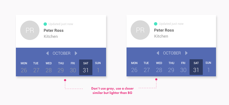
Text color (on colored backgrounds)
- Do use white to emphasize important text
- Don't use gray text on colored backgrounds. Instead, choose a color that is really close to your background color but lighter.
- Don't just lower the opacity. Use an exact hex color to approximate the color you are trying to achieve
This is by no means a comprehensive study on typography but it's a starting point to applying the principles of typography and visual hierarchy to to your UI and Web designs.
Checkout Part II - UI Design in Practice Series: Color
Have you tried any of these techniques in your designs? Let us know in the comments!
References:
https://tutvid.com/web-graphic-design-inspiration/10-tips-10-great-font-pairings

Find this article helpful? Get more content and free courses by signing up to our newsletter!