Boxes helps us create organization, separation and relationship. Here are a few tricks to grouping your content into containers and how to style those containers to deliver impact and quality of aesthetic and overall better UI and UX design.
This is Part 3 of our UI Design in Practice Series
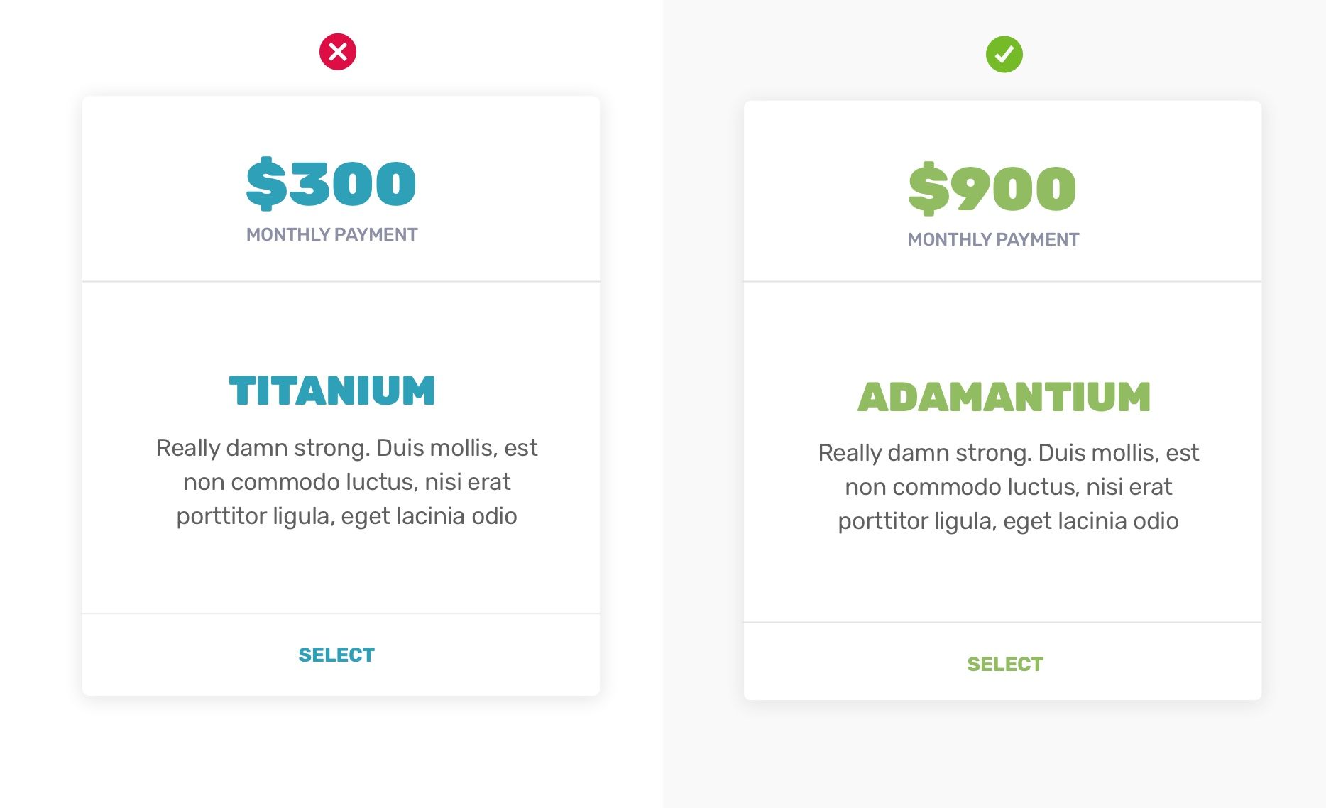
Lighten those outlines
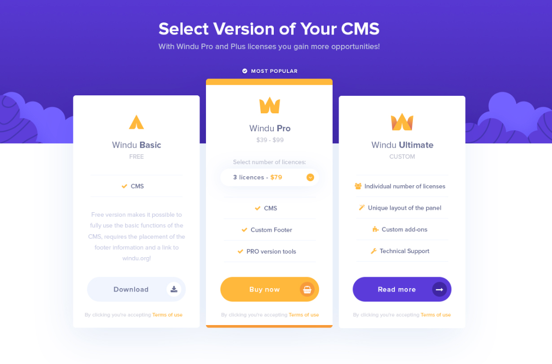
Outlines are meant to contain your content, not imprison it. There's no need to use harsh outlines and there's hardly ever a need to use black outlines. Whenever you are boxing off some content such as a pricing box, choose a border color that is only a bit darker than your background. The effect will be subtle, but impactful.
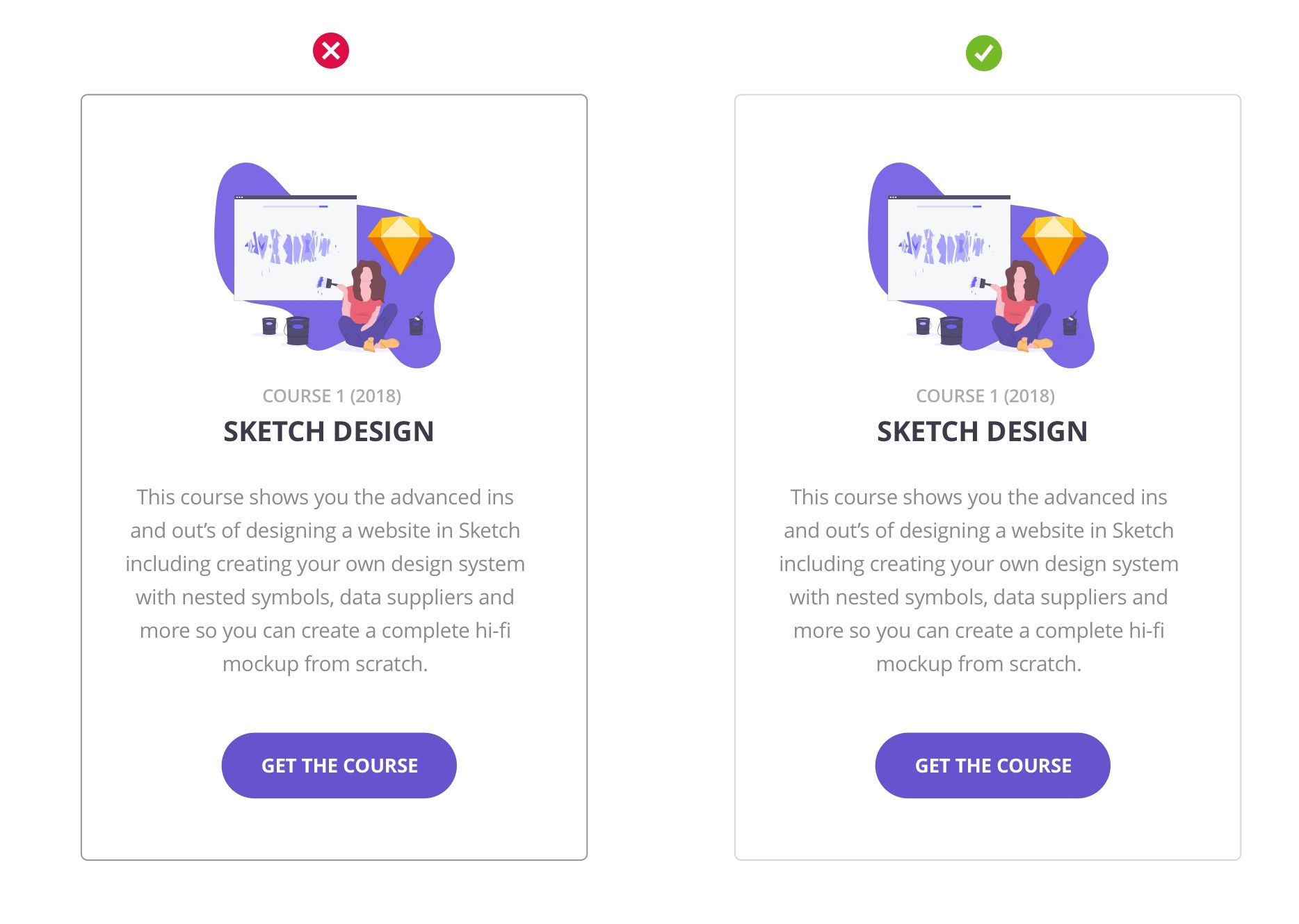
You don't have to use gray all the time either. Tinting your borders and dividing lines with your brand color is another way to lighten the container bounds without drawing the eye away from what's important— the content in the box.
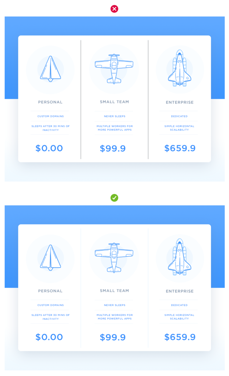
Shadows in lieu of borders
What if you got rid of the border lines altogether? It's totally doable! All you need is a good outer shadow to create the separation between containers
Lift Off!
Try a combination of no borders and one really crazy shadow to create visual hierarchy and give a 3-dimensional effect.
Create this effect by adding a really big spread to your shadows and leaving the other containers without borders or shadows. This could also be a great micro-interaction concept for a hover state (such as for a pricing box), to give the user a sense that they are singling it out and lifting it off the page to inspect it more closely.
Tip - When using shadows, always think about the way light works in real life and how it actually hits things and where they the shadows are cast. Mimicking natural light and the real world will give you the most comfortable results and make your designs seem more refined.
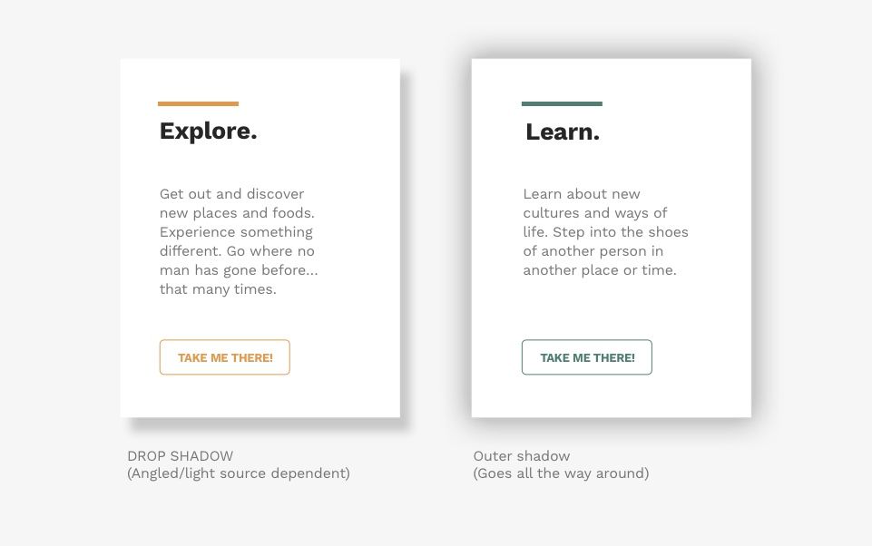
Drop shadow vs Outer shadow
Coming from Photoshop you may be familiar with the 'Drop shadow' layer effect. You also might know of the 'Outer glow' effect which can be used similarly to the 'Shadow' effect in other apps like Sketch.
The main difference is that a Drop Shadow uses the angle of a perceived natural light source to cast the shadow to one side of the object. While an Outer glow/Outer Shadow or full shadow casts the shadow evenly around the object. Both types give your object a lift and 3-dimensional effect. I've exaggerated the difference here:
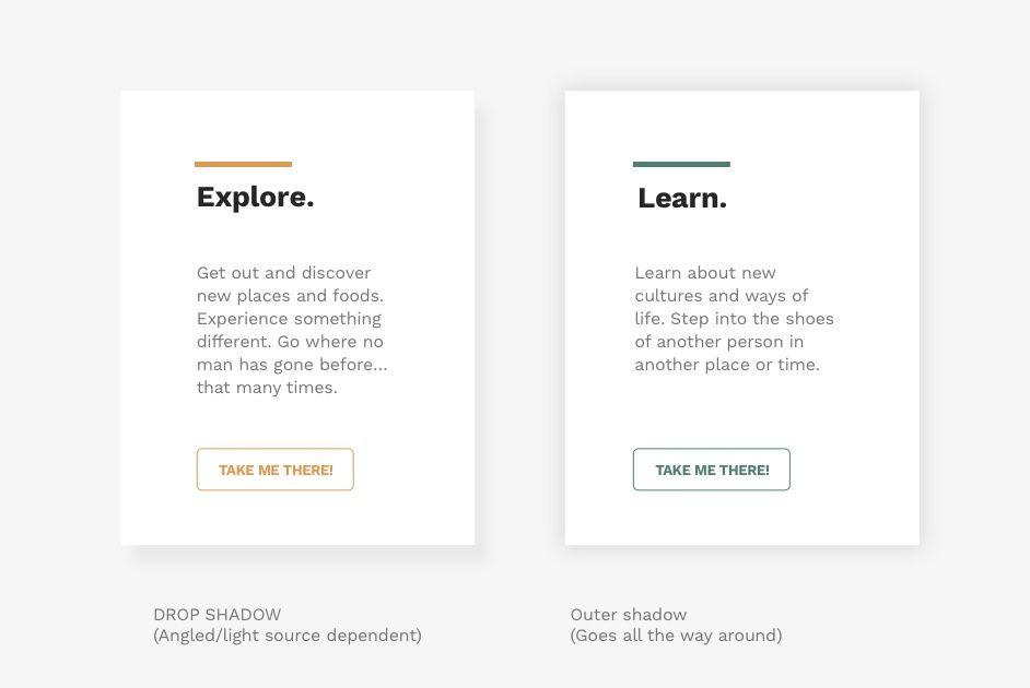
Make is soft
But don't stop there! Regardless of which type of shadow you decide to use, make sure that you increase the blur and the spread and lighten the color so it's soft. You always want to avoid really harsh shadows unless it's a clear intention of your personal style and even then, photorealistic is best. See how much better this looks?
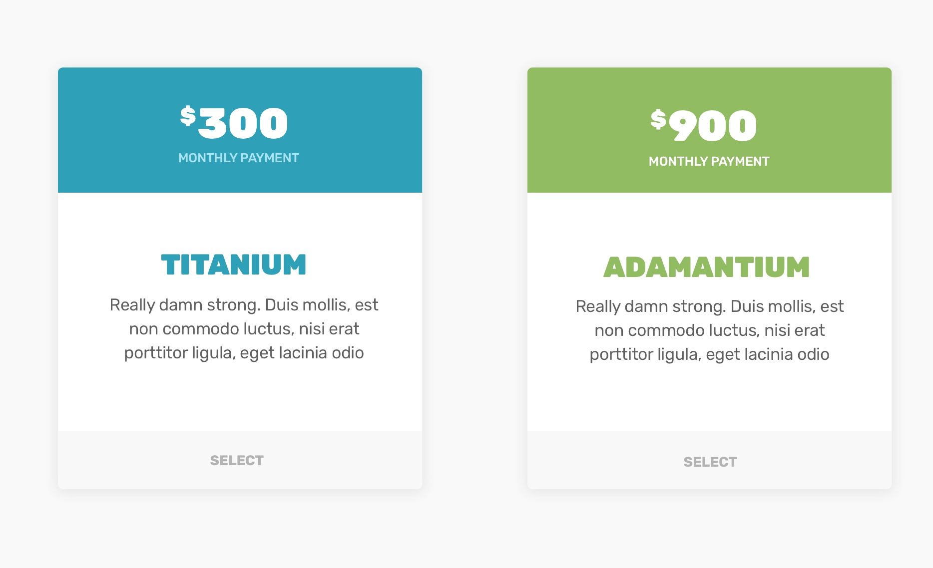
Throw some shade
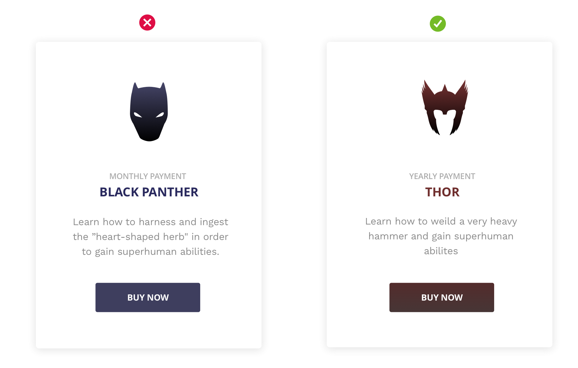
Use two different shades: One for your background and one for your boxes. If your box is light, make the background a wee bit darker, if your box is dark than make the page lighter or white.
Splash the color, don't drench it
Add interest with a pop of color to background or to emphasize sections of your content.

Tint it
You can really drive your branding home by tinting things with your brand color (more about color in practice here). For this example, I've taken the same design and changed the background color of the page to a very light shade of my branded blue and then changed the color of the shadow itself to a slighter brighter version of my branded blue. This completely changed the look of the design and all I did was slightly change the saturation and hue of my colors.

Scale it
You can also use the size, proportion and position of boxes to create hierarchy and importance. If you want to feature one out of set of things, try making the featured item larger and positioning it in front of or overlapping the other items.

Again, this is another nice opportunity for an animation, slider or micro-interaction when thinking about the user interaction and experience.
Contain it with alignment
Alignment is everything in design. Whether you choose to use a grid system or just relational alignment and rhythm. One way to separate your containers or cards is by suggesting the containment through a grounding object such as an icon or image.
And that's it! These tips and tricks are really useful in practice and may help you when you're stuck trying to separate your content, they are all grounded in more complex design theory that deal with rhythm, patterns, hierarchy color etc.