This is part 2 in our multi-part series on user interface and web design.
Read Part 1 - UI Design in Practice Series: Typography
There is much to be said on the topic of color, color theory and color psychology. Our focus here isn't on the fundamentals and principles of colors, but rather on a few tricks you can use to improve your designs and get some practice applying color to your user interfaces.
Hues, tints, shades, tones, saturation and brightness, analogous, monochromatic, triad, complementary and compound color schemes, these are all terms you've probably come across before. As important as this can all be to understand, sometimes us aspiring and working designers could benefit from a framework to place these foundational concepts into and have a little fun with it.
Color Harmony
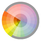
Color harmonies refer to the relationship of one color to another on the color wheel. The most notable being:
Monochromatic: Colors that are shade or tint of the same hue.
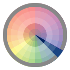
Complementary: Color that are across from each other on a color wheel.
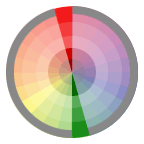
Split-Complementary: One hue plus two others hue's that are equally spaced from its complimentary color.
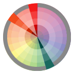
Double-Complementary: Two complementary color sets.
Analogous: Colors located next to each other on a color wheel.
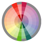
Triadic: Three hues equally positioned on a color wheel.
Images courtesy of http://www.worqx.com/color/combinations.htm
While this may be a good reference, I've personally not found that I haven't gotten much mileage out of knowing these relationships; theory and semantics specifically. As a self taught designer, I have mostly relied on my 'color instinct' , which I developed over years and years of practice in applying color to different mediums. As you develop your instinct, color theory can be a starting point to thinking about how similar or contrasting colors can be paired together with some degree of success. That being said, I usually use my instincts, along with client feedback and market research, to employ a few simple tactics to derive the colors in my interface palette.
Choose your base color first
Your base color or primary color is the best place to start your palette. This will most likely be your brand color.
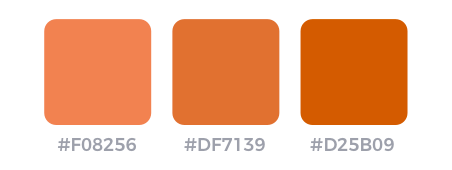
Let's say you're designing a budgeting app for a client. Based on your market and user psychology research you've discovered that people are intimated by budgeting, they find all that finance talk and number input scary. Industry competitors use colors like financial blue, red and green. You want to differentiate yourself and set the tone that your app is much more approachable.
Your client wants to go with blue because they are nervous about standing out too much or using too much color. So let's try using blue in an effective way.
Modify and tint your colors
If you're feeling overwhelmed by color, sometimes the best thing to do is just pick one. Yes, believe it or not you can design an entire app based on just a single color and a few different hues, saturation and tints.
This is often referred to as a monochromatic color scheme.
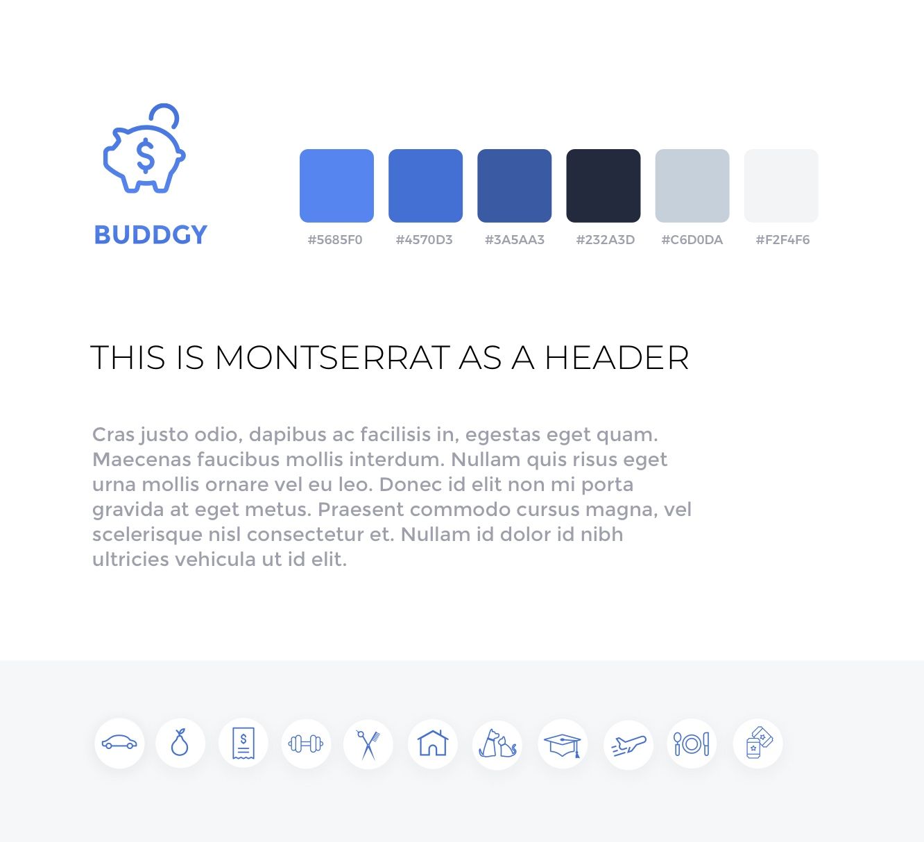
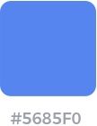
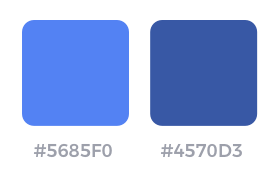
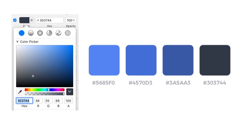
Our primary/base/brand color here is #5685F0
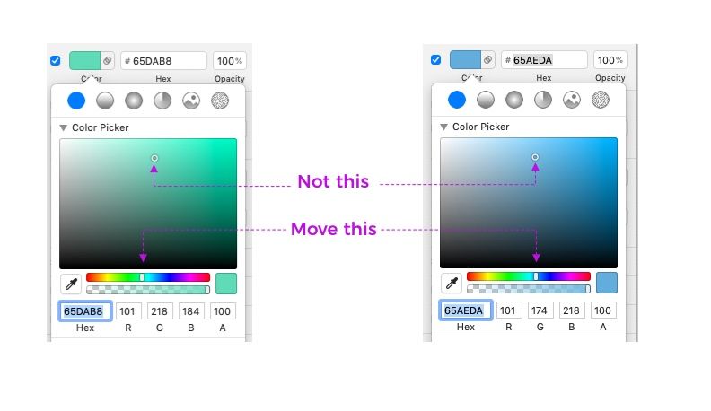
From this, we can derive the rest of our colors. The theory here is to create a palette that uses variations on this blue theme. We're going to change this base color just slightly by changing it's tint and hue to create a new color.
How did we do this?
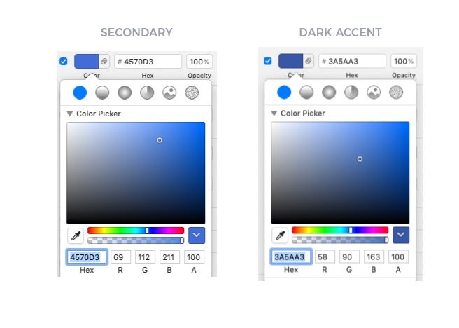
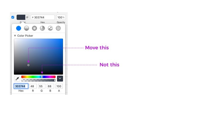
Well one trick is to pull the color picker spectrum dot just slightly down a few degrees. Just by eye-balling it and moving our mouse down, you can preview what this looks like in a darker shade. This gives us a secondary color of #4570D3
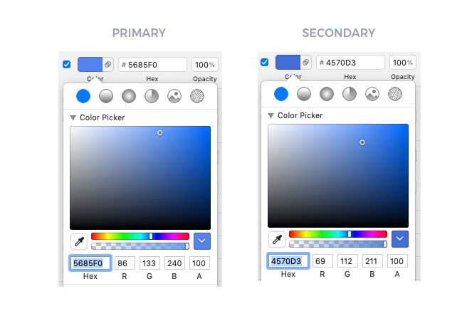
Another way to achieve this is by using little math. I've found that if you subtract a specific amount from the R,G,B of each hex you can find a pretty good looking next color to work with or at the least, to use as a starting point to experiment with.
The math:
Take the primary color and subtract the following amounts:
R-17
G-21
B-29
So for the secondary color you would end up with:
86-17 = 69(R)
133-21 = 112(G)
240-29 = 211(B)
Now for third color (such as a button hover state or dark accent), you can either eye-ball it by dragging your color picker point down a bit or subtract the following from the secondary color you just derived:
R-11
G-22
B-48
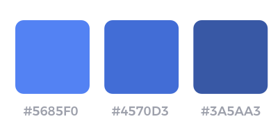
And if you're wondering... yes this works with other colors! Go ahead and give it a try!
Choose your darkest shade
Now we need a workhorse color. Something that we can use for headlines and maybe body text. Something dark, almost black, but not quite. The trick here is to tint your black or gray with your brand color. So select your primary blue on the spectrum again and drag that color over and down to your left into the gray/black area.
Darker version = higher saturation + lower brightness
Choose your 50 shades of gray
Now let's get a little kinky with grays. You're going to need them and you're going to need a lot of them. Don't be afraid to be liberal.
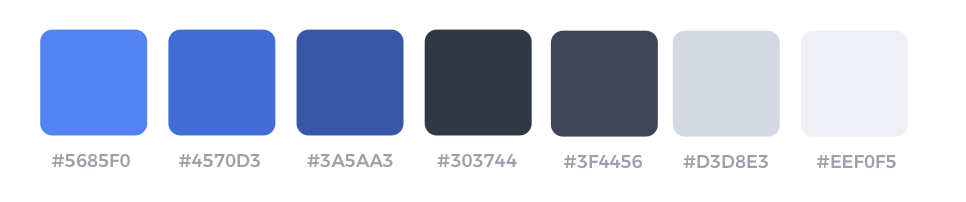
When working with monochromatic color schemes, each time you choose a color–whether it's lighter or darker than your base color, the trick is to never move the slider. Move the picker dot around all you want, but leave the slider alone.
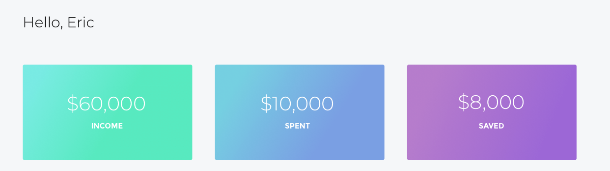
Now let's apply these colors to our app and see what it looks like
In this example you can clearly see how we've used all the different shades of blue and gray. The primary blue, which is used to draw the eye towards important information at top of the hierarchy, the darkest gray to recede the navigation and showcase the header text and all our shades of gray to create dimension and separation between our boxes.
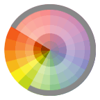
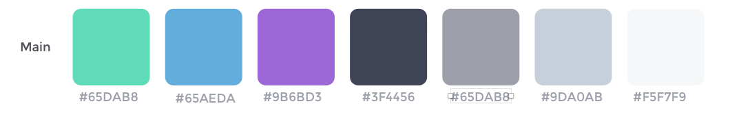
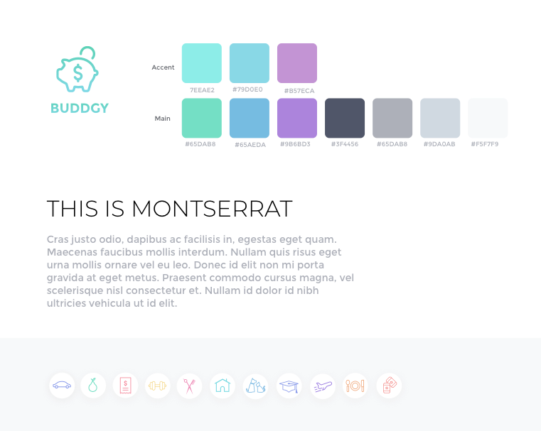
Analogous Color Scheme
Now let's try an Analogous color scheme using the same example. Let's say you want to explore another look and feel for your app. Even with the same content and layout, color can do so much to change the mood and voice of your UI.
By moving from a monochromatic color scheme to an analogous one, we've created a feel totally different to what we had before. The app seems lighter, more friendly and approachable and softer. It's got a less serious vibe about it.
How did we do it?
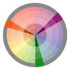
Analogous as we mentioned above, refers to colors that sit right next to each other on the color wheel
In our case - Green, Blue and Purple.
When creating an Analogous color scheme the opposite is true of the monochromatic technique. Here you'll actually want to move the handle of your color pick rather than the picker point in the spectrum itself.
Then I used the same technique of tinting my colors with my brand color and choosing a bunch of grays.
Now for a little extra pizazz, you might notice that the 3 main category boxes at the top have a gradient on them. This is done by choosing a variation of the main color that is lighter and has more white in it. You could also choose a color that's a little but different from the main color (but also lighter) and use that as to give it a more 'rainbow' spectrum feel.
Lighter version = lower saturation + higher brightness
Ok, so now we've built a totally different color palette by using a variation of our little tricks.
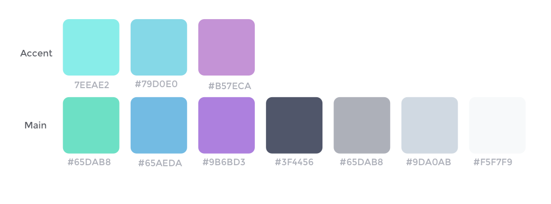
I've decided to also make the icons a little more colorful and have a different hue for each category. For that I used a combination of Analgous and Triadic to get a bit more variation.
Recap
- Color is subjective, the best place to start is with good market research and appealing to user psychology.
- Be empathetic to your users: Think about your medium and make sure you use colors that are accessible to all.
- Tint all your colors with your brand color
- Move the handle or the color picker. Don't do both unless you really know what you're doing.
- Create a color palette using a combination of good design principles, eye-balling, spectrum select and move technique or math. We each arrive at color in our own way, experiment play and have fun with it!
- Don't be afraid to use just one color or combine different color schemes just make sure they harmonize well.
How do you use color in your design? What tips and tricks would you add that make it easier to choose a good color palette? Let us know in the comments!
Here's another resource on how to choose perfectly matched color palettes using only numbers!
Want to learn everything about product design (UX/UI)? Come join our Product Design Course!