All buttons are not created equal, but they can all look equally as good.
This is Part 4 of our UI Design in Practice Series
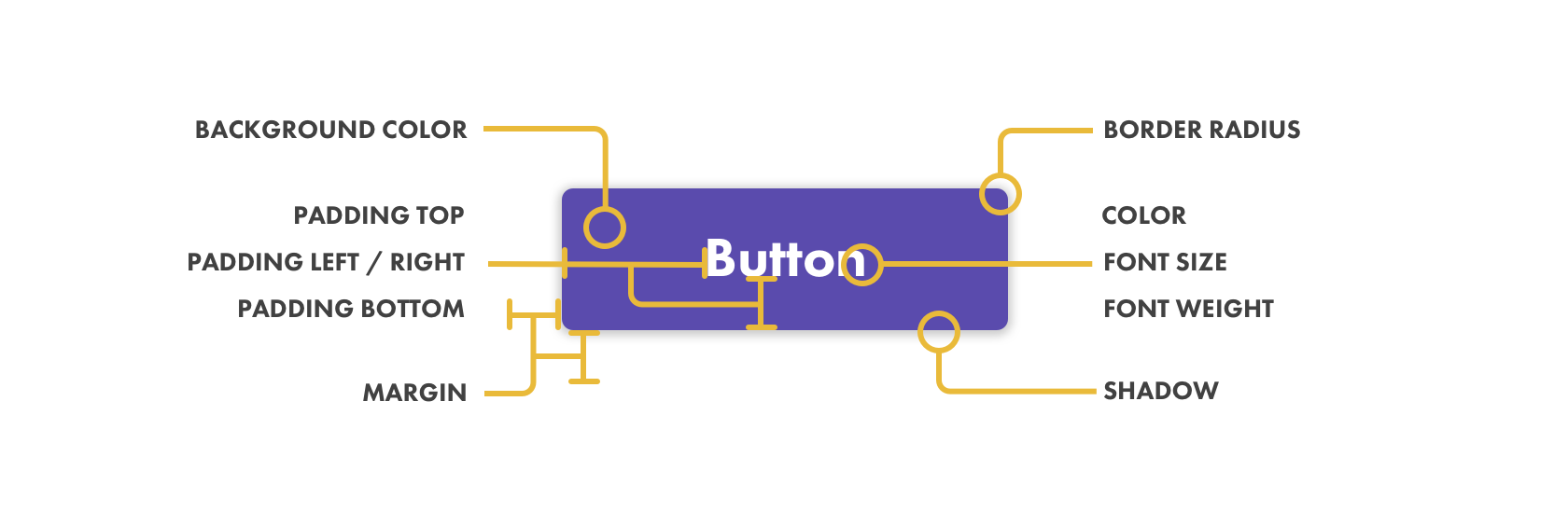
Anatomy of a button
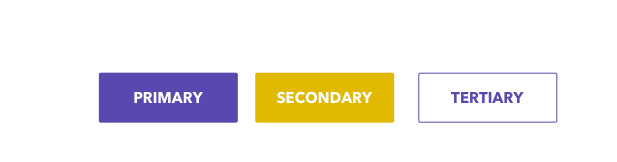
Button colors
It's best to start with 3 button colors
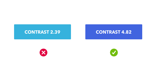
It’s also important to choose colors with adequate contrast for most users. I use the Contrast app to test my designs for WCAG 2.0 compliance:
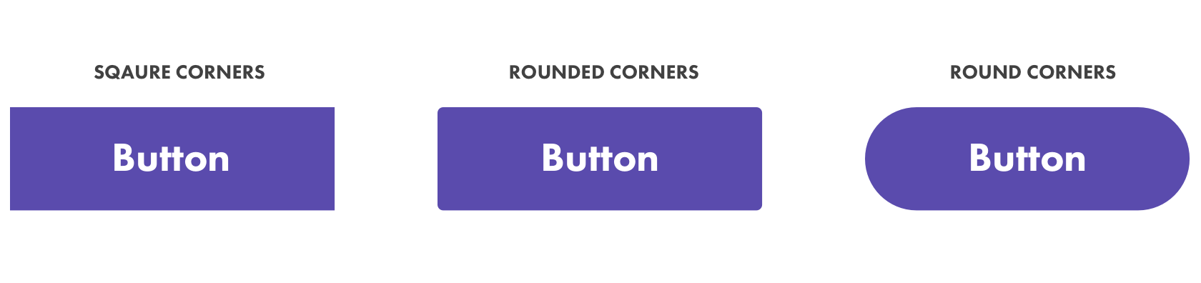
Button radius
Be decisive with your radius roundness. If you're going to go square, go square. If you want to go rounded stick with 3-4px of roundness. If you want to go oval go all the way to 100px of roundness.
Button sizes
You need to account for all the possible environments your button might be in as well as the variability in length of text you might encounter.
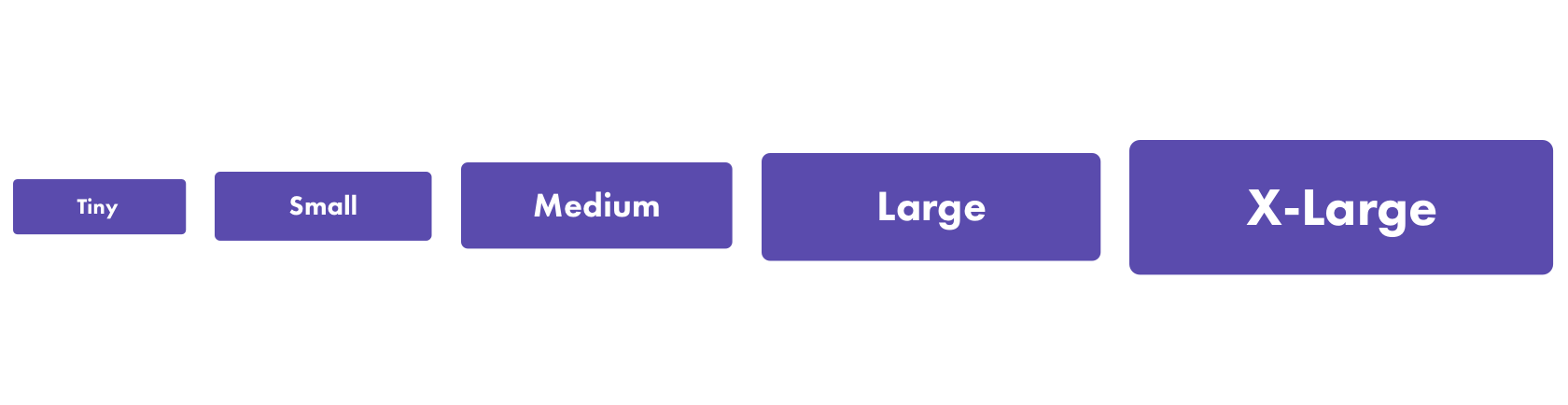
Pad, pad and pad some more. Create room by making the button itself significantly larger than the size of the text within the button.
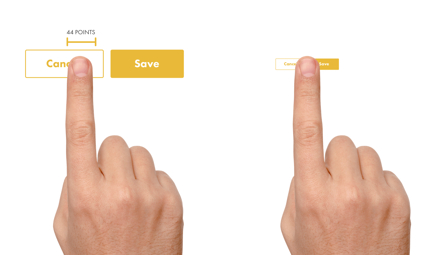
Mind your hit targets
Be mindful of the device your buttons will be viewed on and make sure that the size and spacing is finger friendly.
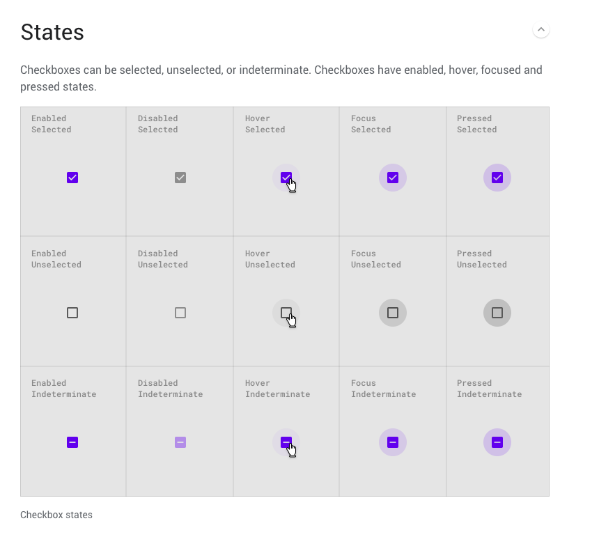
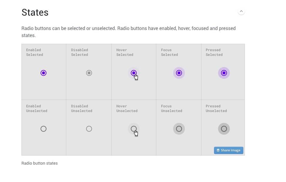
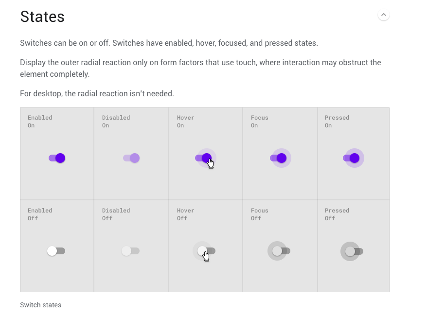
Button interaction flow
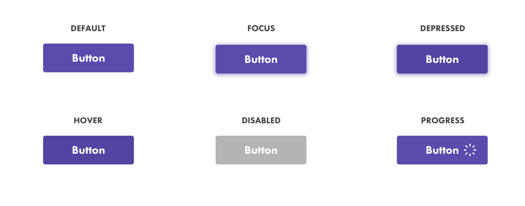
- Default - this will be your primary button color
- Focus - allows for navigation via keyboards or other directional input devices
- Depressed - when a user is mid-click on a button just before the let go.
- Hover - when a user is hovering over but has not yet clicked the button
- Disabled - A state in which the button cannot be interacted with
- Progress - when an action has been triggered but is still in the process of being completed
Success and error
- Success - the color a button becomes when the action taken has been successfully completed
- Error - the color a button becomes when the action taken has not been successfully completed
A simple rule is to make success buttons green and error buttons red. If your primary or brand color is red then you may need to choose a different color.
Button or link?
Using uppercase text to distinguish a button from a nearby link can be a good idea.

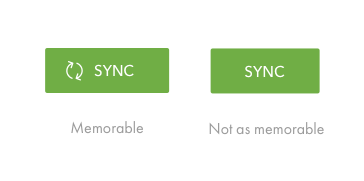
With icons or without?
Pairing a button label with an icon can reinforce meaning and make it easier to recognize.
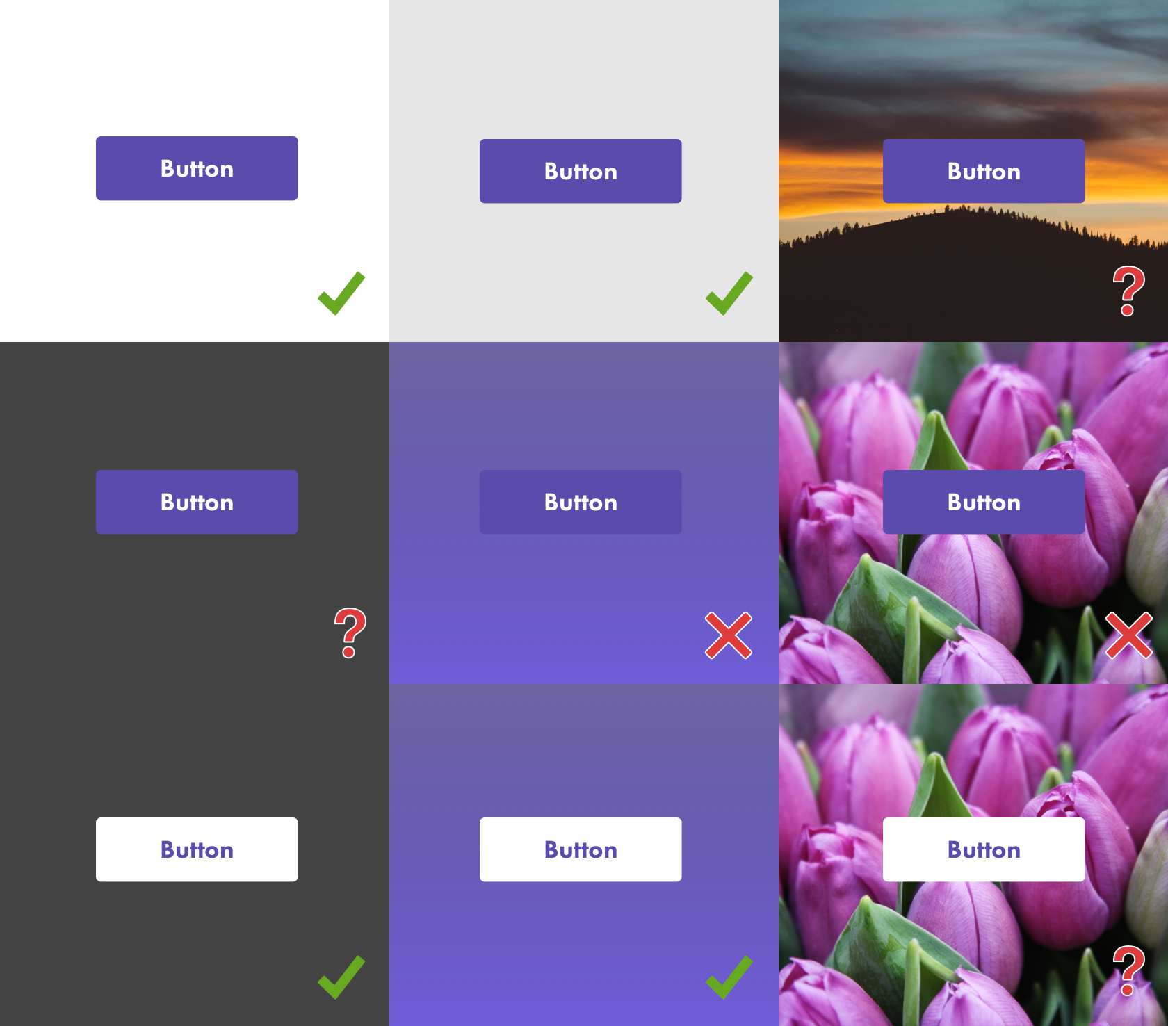
Button on different backgrounds
Your button might look great on white, gray and solid backgrounds but what about over images and gradients? What about outlined buttons? Make sure you preview what this might look like and have a backup plan in place.
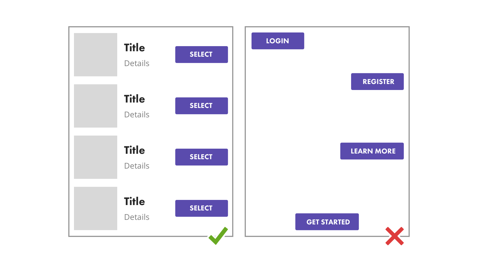
Stacking buttons
Clearly define when to and how you will use primary buttons when there are more than one required.
For instance, maybe the user needs to select more than one element in a row that is the same this is a safe time to repeat a primary button color. However its better to refrain from using the same color if the CTA of the buttons are different.
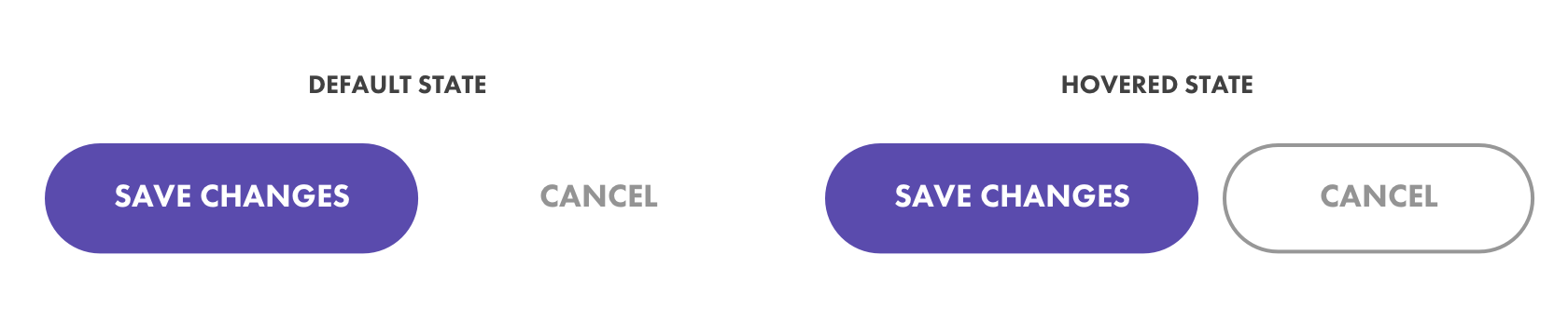
Unsolid buttons
- Try inferred existence by placing plain text next to a button and giving it a hover action
- Try outlining a button rather than use a solid background color. Also make the text within an outlined button the same as the color of the outline. These are called Ghost buttons - be careful with them, it's been studied that these can be hard for users to notice.
Text
What is the verbal tone?
Should we inject a brand voice or not? What is the common practice?
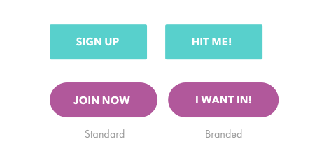
Button messaging
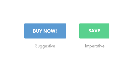
Is the message of the button an imperative action or a suggestive action?
Imperative: Things like 'save' when editing a document
Suggestive: Things like CTAs that say 'click here' or 'learn more'
Don't wrap text
Text should always be on the same line
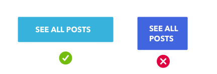
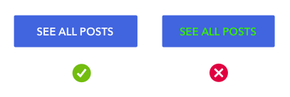
Try to avoid using colored text. Stick to white, gray or black or use your primary color for outlined buttons
Icons as buttons
Buttons don't always have to be round or squared and contain text. Sometimes buttons are just visual representation of the desired location or action:
Heart shaped buttons for favoriting and thumbs up for liked.

Mobile menu icons without text

Arrows for navigation

Selection controls
Check boxes
Radio buttons
Toggles and Switches
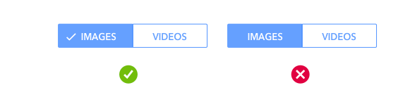
Note on accessibility
Colorblind users can have difficulty notices when something changes through color alone. Make state changes clear with more than just color by using icons as a visual cue.