
"I can recognize good UI design, but how do I make my UI designs look like that?!" This is a question that a lot of our design students have. Even seasoned designers might spot a great-looking design but are unsure of how to accomplish such a polished look. Maybe you've spent too many hours drooling at the posts on Dribbble but can't seem to mimic them. This article take complex UI design terminology and principles and breaks it down into a few easy practical steps that you can take to make your designs look amazing right now!
1. Typography and Visual Hierarchy
Text weight - Making a single font seem like 2 different fonts
You don't have to go crazy with font pairing. Pick one great font family that has a few different weights and styles and apply the principles of visual weight (or hierarchy) and color to differentiate them:
- Increase the weight of your important text (like headers)
Decrease the weight of your less important text (like subheaders and body text) - Stick to 2 font weights.
- A normal font weight (400 or 500 depending on the font) for most body and paragraph text
- A heavier font weight (600 or 700) for text you want to emphasize like header and subheader text
Text size
- Increase the size of important text, only slightly
- Decrease the size of your less important text proportionally in relation to the important text
Text color (on white backgrounds)
- Choose a very dark gray color over black for the Header text. It's good to always keep in mind accessibility standards and never go too light with your grays, but just an ever-so-slightly reduced black can really increase your aesthetic without compromising anyone's ability to see it.
- Tint that dark gray (ever so slightly) with your brand color
Text color (on colored backgrounds)
- Do use white to emphasize important text
- Don't use gray text on colored backgrounds. Instead, choose a color that is really close to your background color but lighter.
- Don't just lower the opacity. Use an exact hex color to approximate the color you are trying to achieve
Font Pairing
Font pairing is a choice between contrast and similarity of style. The tone of your brand should give you a good jumping-off point
- Don't combine more than 3 fonts, 2 is usually enough
- For a more modern look combine 2 Sans serif typefaces
- For a classic look, combine the Serif header typeface with a Sans Serif body typeface
Font Sizing and Typescales
There are many different Typescale you can use it to determine the relationship and hierarchy between the difference sizes of your text elements. For most things, I like to use the Golden Ratio to determine font sizing = 1.618. Here how to apply it
Let's say you use 50pt for your body text (I chose 50pt because it's the smallest text that I think is most legible on most devices. Let's use that size to determine our next largest text size by multiplying it by the golden ratio. 50x1.618 = ~81pt Subheader text. Now let's get the size of the Header text by using this new number. 81x1.618=~131 x1.618=~212pt ( I like to multiply my header by the golden ratio one more time to get a really prominent size for my header).
So now you have the following:
Header: 212pt
Subheader: 81pt
Body: 50pt
Try testing your font sizing using a modular scale
2. Boxes and borders
Boxes helps us create organization, separation and relationship, here's how to elevate their style:
- Don't use an outline, use a box shadow instead.
- Increase the blur and lighten the color so it's soft
- Try off-setting your box shadow so it mimics natural light rather than increasing the blur all the way around.
- Use two different shades: One for your background and one for your box. If your box is light, make the background a wee bit darker, if your box is dark then make the page lighter or white.
- Add interest with a pop of color, such as a divider on boxes or background color as call-outs or separation between elements
3. Dividers and Grouping
- Just as with boxes there are a few ways to separate elements and sections that are on your page as well as items that are within your boxes.
- Use shading and color rather than borders and lines to separate page sections.
- Use a watermark shape as a section separator.
- Use low opacity gray lines to separate page sections or modules.
- Use shorter, thicker colored lines above or below header text to denote the relationship to grouped content.
- Use space as an imaginary divider for separation rather than any actual divider at all.
4. White space and spacing
- Put space around stuff. Adding a healthy amount of padding around your page, around buttons and around text gives everything breathing room and just looks more polished.
- Use spacing between elements to denote relationships.
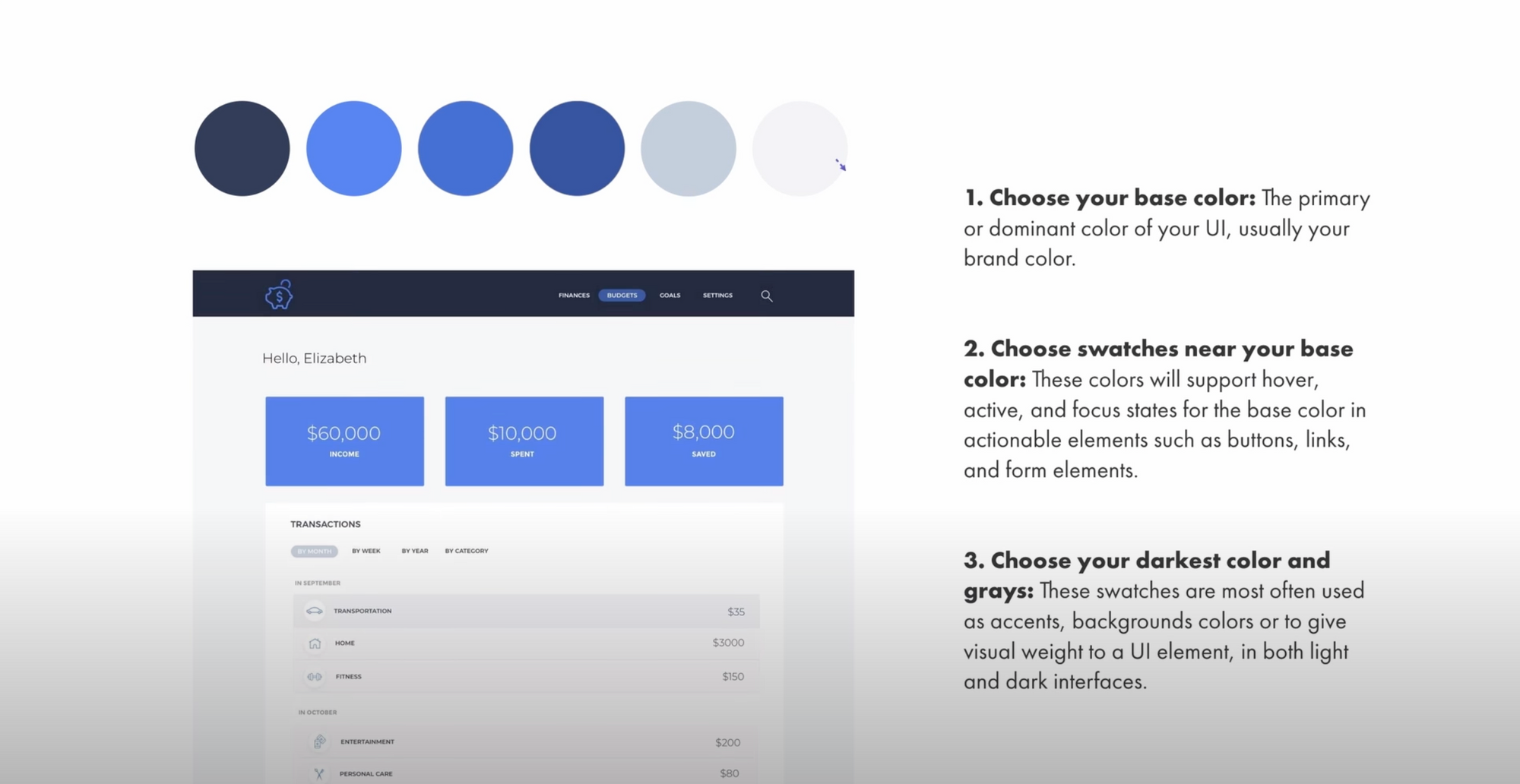
5. Color Palletes
- Create a color palette using good design principles
- The contrast is good but not too harsh
- Make your colors just a little less vivid by changing the hue
- Tint your grays with your primary brand color
- When creating your color palette move the color slider handle but don't move the color wheel focal point
6. Applying color to your UI design
Once you've chosen your color palette, you can use your primary or base color throughout your design simply by expanding on it with slightly lighter and darker shades of the same color.
7. Icons
Icons are meant to be small visual representations of your content. Here's how to keep them looking great
- Keep them small. Unless they are elaborate illustrations they should stay at the standard 16px or 24px.
- When going larger than this give them more detail
- If you are using dark icons, be wary of using pure black. If you can, use a very dark gray tinted with your brand color as it will make the icons look more refined
Icon sets
- Try to use matching icons from a set when you can
- Make sure all of the icons have the same line thickness
- Make sure all the corners have the same or similar roundness
- Try enclosing your icons in a shaded shape
- Use little pops of color in the icons design itself to create interest
8. Buttons
All buttons are not created equal, but they can all look equally as good:
- Pad, pad and pad some more. Create room by making the button itself significantly larger than the size of the text within the button. A good rule of thumb is
- Try inferred existence by placing plain text next to a button and giving it a hover action
- Try outlining a button rather than using a solid background color. Also, make the text within an outlined button the same as the color of the outline
- Be decisive with your radius roundness. If you're going to go square, go square with either no rounded corners or 3-4px of roundness. If you want to go oval go all the way to 100px of roundness.
9. Images
- Add image scrims or overlays to your images with a box that is tinted with your brand color. Lower the opacity when it's behind text. The text on top will pop and will appear much more crisp and legible.
- Make sure the color in your stock photos and images complement your brand colors
Hopefully, you have found these pro shortcuts useful. If you did please share on social media and tag @designerupco. If you're interested in really leveling up your skills check out our more lessons, tool and resources on DesignerUp.co
For a deeper dive into these topic, check out the following articles:
https://tutvid.com/web-graphic-design-inspiration/10-tips-10-great-font-pairings
https://medium.com/refactoring-ui/7-practical-tips-for-cheating-at-design-40c736799886
https://material.io/design/iconography/product-icons.html#design-principles

Find this article helpful? Get more content and free courses by signing up for our newsletter!